
PROJECT: HASTE UI BREAKDOWN
screenflow
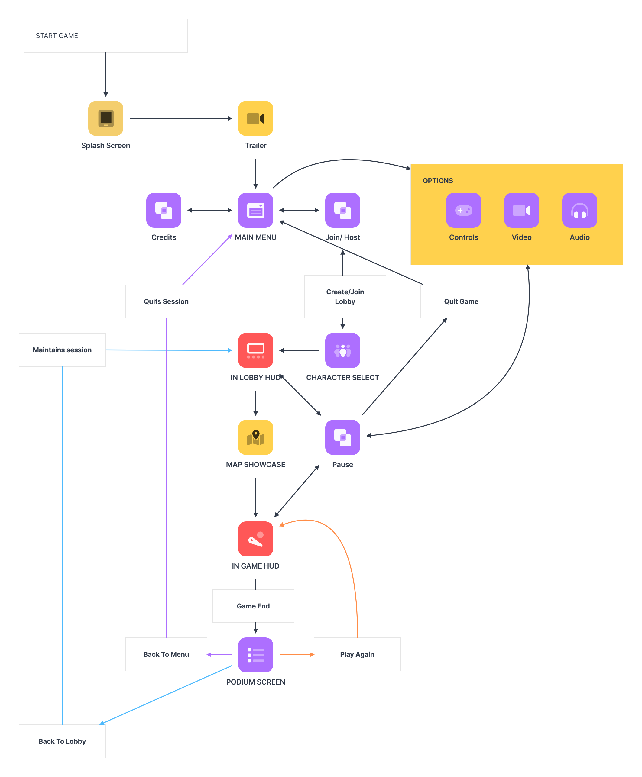
In designing the screen flowchart for Project: Haste, our primary objective was to streamline the onboarding process to get players into the game as swiftly as possible. We began by pinpointing the essential information required for players to start: their username, character selection, and their preference to join or create a lobby via code.
To enhance user experience, we incorporated a Character Select Screen immediately after the Join/Host Screen, allowing players to view and select their character after joining or hosting a lobby. This design decision also accommodates players' desire to see character choices made by others before finalizing their own.
Once in a lobby, players stay there until the game begins. During gameplay, players have the flexibility to pause the game at any time. The pause menu provides options to either return to the Main Menu or access the Options Screen directly, ensuring a seamless and intuitive gameplay experience.
This streamlined approach not only expedites entry into the game but also enhances overall player engagement and convenience.
Join / Host
The Join / Host screen is the screen I’m most proud of, so this is how it became real from the wireframe.
The initial goal was clarity and immediacy. Given the familiarity of joining or hosting games online, we aimed for a design that required no explanation for its functions. It was essential that users could intuitively grasp the purpose of each button

Preproduction Wireframe
From there, the visual direction took shape. Inspired by comic book aesthetics, I envisioned the screen as two panels side by side. The choice of colors emphasized high contrast to enhance visibility and engagement.
Deciding the order of Join or Host was the next step. Understanding that most users read from left to right, and in the context of a typical 4-player game where one hosts and three join, we opted to prioritize Join as the first option.

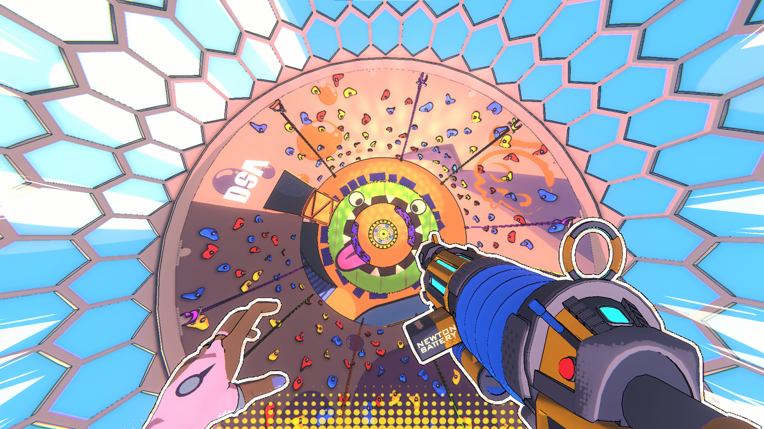
Pre-Alpha In Game
As development progressed, integrating the game map into the UI navigation became a key feature. Each screen in the menu pathway was designed to seamlessly lead through the game's Deathmatch Map. Evolving from a classic comic style, the new iteration focused on highlighting the dynamic sports theme of the game. This involved refining the typography with a cleaner font in white, ensuring it stood out crisply against the background for easy navigation.
To add a touch of vibrancy, animated paint streaks were introduced, injecting visual flair and dynamism into the screen. This not only complemented the comic book style but also enhanced user interaction through subtle animations.


Final Release