
Restyling “haste”
Developed by Pronto, "Haste" is an indie multiplayer first person shooter that originated as the student project "Project: Haste." The goal was to update the UI art style, retaining the game's dynamic, sporty character while making it accessible and enjoyable for all players. I was both the UI / UX Designer and Artist working on the following content, but this post only breaks down the UI art.
INTENDED PLATFORMS: PC, MOBILE, CONSOLE
DISCIPLINES: UI ART
DURATION: 2 WEEKS
CHALLENGES:
Finding a style that is a mix of simple rounded elements and angular “sporty” elements
Drawing focus on visually engaging interfaces without compromising clarity or usability
Ensuring legibility by designing icons and text with mobile screens in mind.
Crafting a colour palette that accommodates varied screen themes while preserving consistency with button colours.
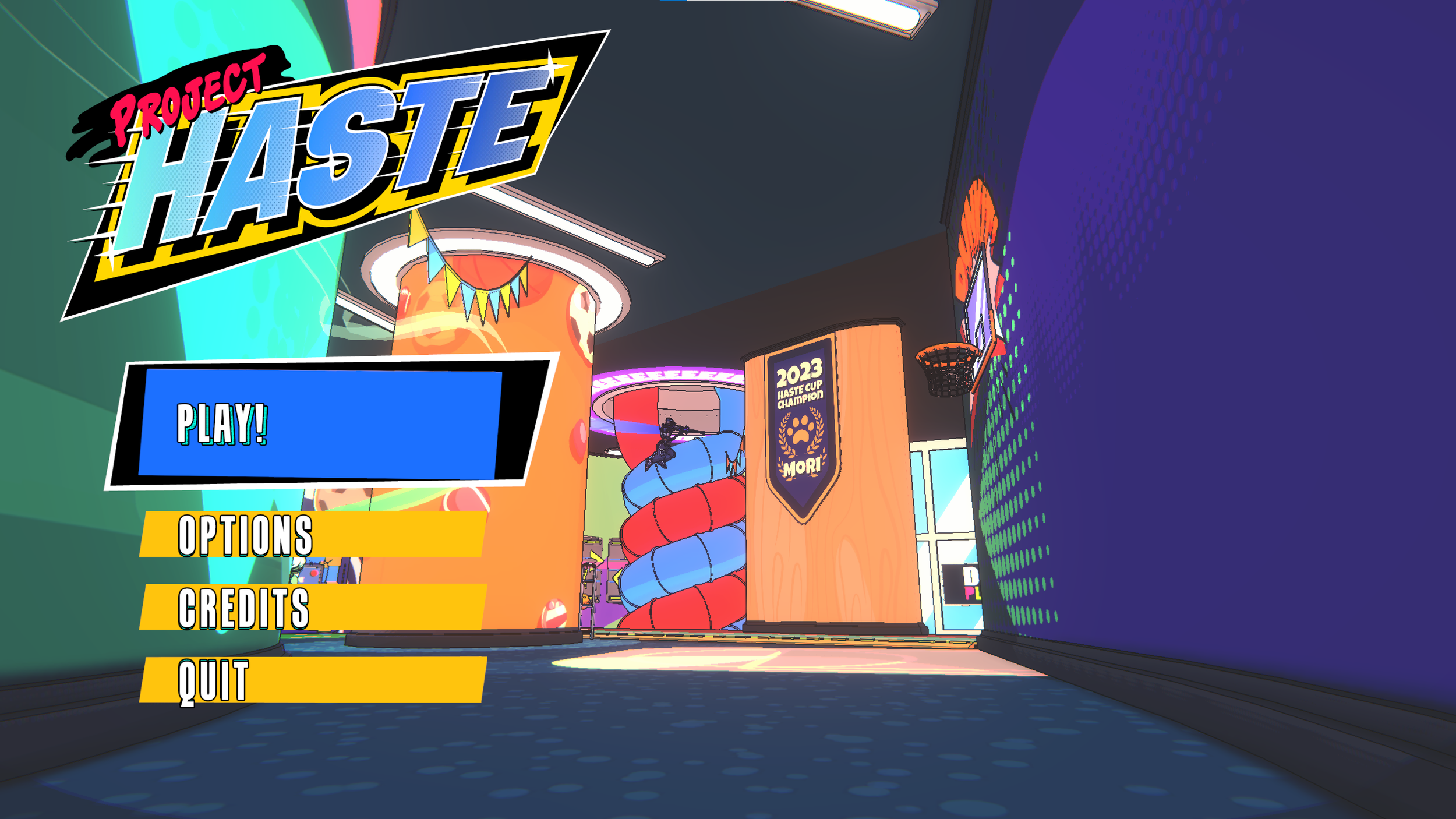

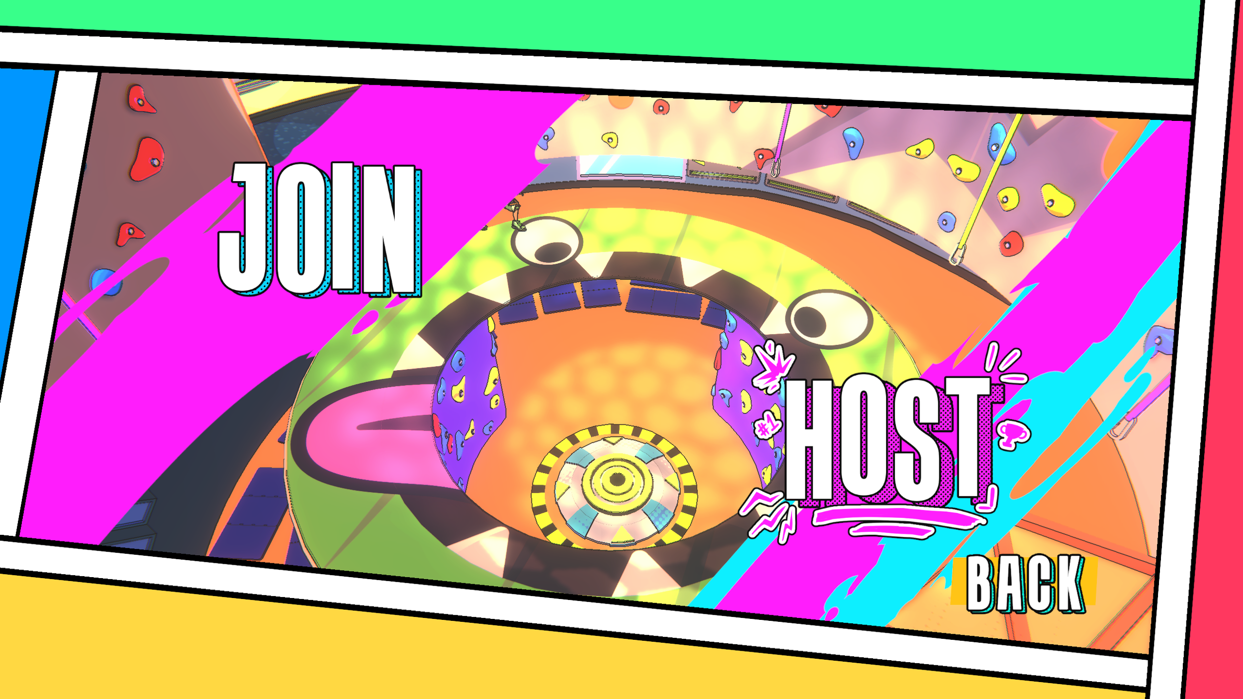
These menus were part of my design work for "Project: Haste." Although they stand out individually, the lack of cohesion between screens was a challenge. The angular elements suited the original concept, but our vision for "Haste" evolved toward a softer, more approachable UI style.

To strike the right balance between angular and rounded elements, I created a linear chart plotting reference UI designs. The target aesthetic fell somewhere between the playful styles of Ninjala and Fall Guys, drawing additional angular influences from Knockout City and a mockup by the talented Nathaly Moyano.

My next step was to analyze my favorite parts from my references. I took the skewed boxes from the angular design and added soft outlines to mix the two styles. To add contrast, I decided to stick to round icons but use sharp textures for the backgrounds of both screens and UI elements.
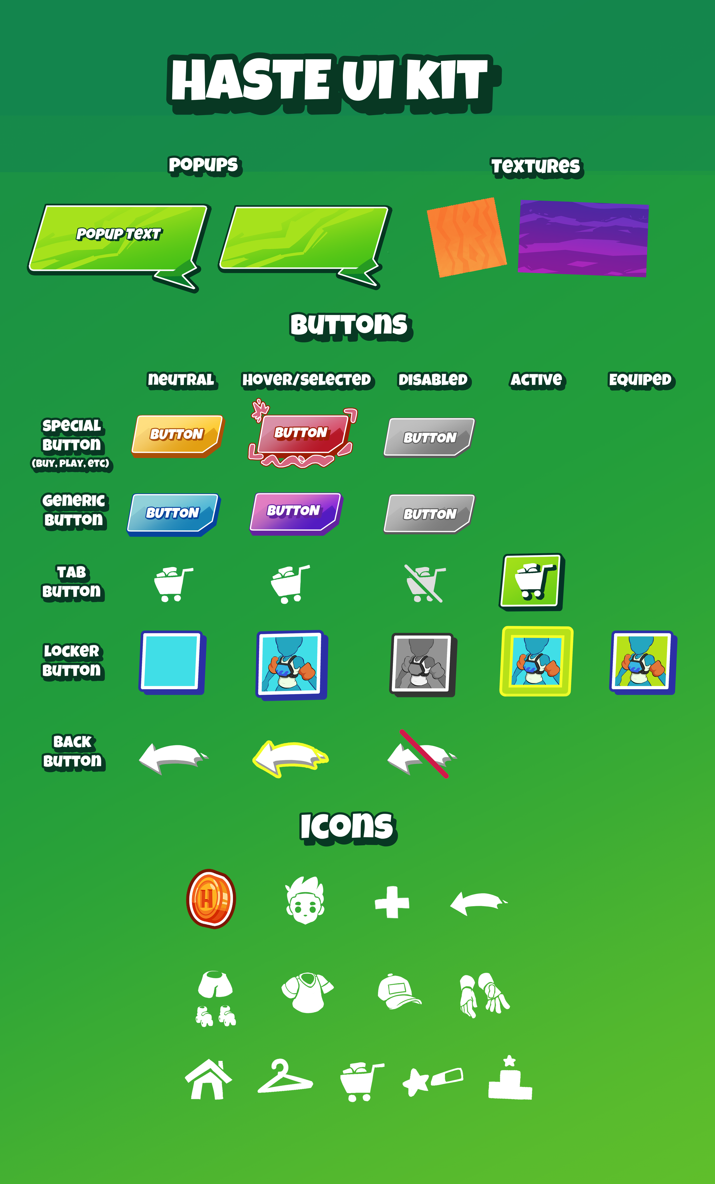
Going back and forth updating this UI kit really solidified the style. Implementing everything from the pillars, I was ready to tackle a screen mockup.

I was very excited to see all the pieces come together for this store mockup. To group different similar functions together, I decided to stick to a split complementary colour scheme for the shop itself. Green was chosen for the traversal of menus, and yellow was chosen for the currency.
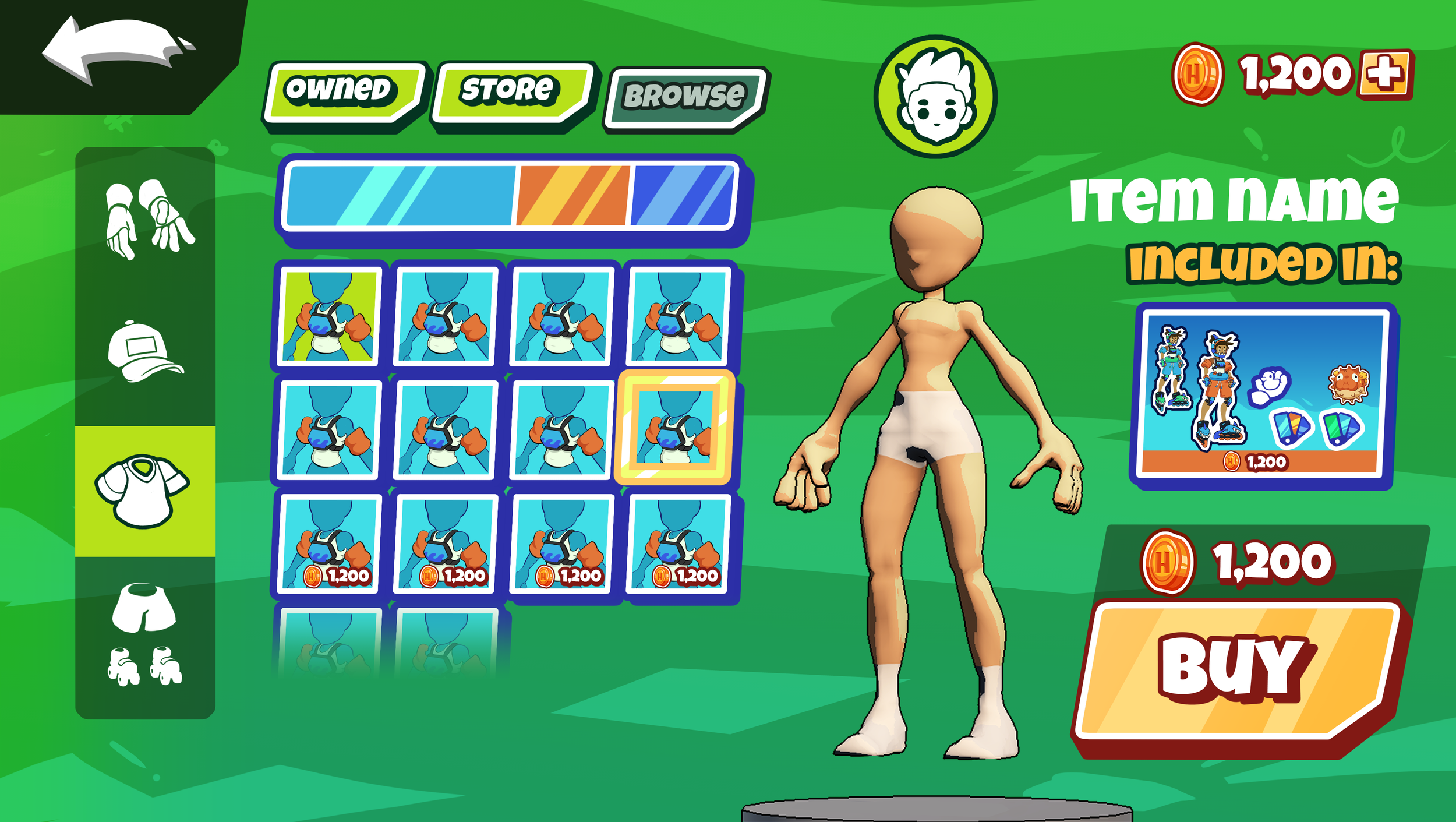
This locker mockup offered some good challenges with determining the number of different colours present on one screen. I had to carefully balance the visual hierarchy of the screen, guiding the eye to the buy/ equip button and the currently selected outfit piece.
Wrap up
That brings us to the present. I am very happy to see how the style transformed into something rivaling some of my favorite games. Excitement fills me thinking about how I will tackle the Main Menu and in-game HUD. I thank you for taking the time to explore my process and hope you check some of my other work.
PS: The design progress for the mock-ups in this post was very interesting, so stay tuned for a UI /UX design post breaking down wireframes.